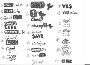
I showed my wife the derivation sketches and asked her to choose her favorite. She actually chose the one I liked the best, the Bigfoot one. For this design I used the most famous photo of Bigfoot as a template and used the pen tool to sketch around the figure. I showed it to my wife and she thought there needed to be fur. She thought it looked like a robber with a ski mask on. So, I went back to the drawing board and tried the “roughen” feature. It looked okay but not quite up to standard. So, I tried again, this time taking extreme care with the edges making sure it looked like the photo while giving off a “furry” look. I added the brow, eyes, nose and mouth later.
I had originally put a regular circle around the bigfoot with a nice thick stroke but it looked a bit out of place so I played around with some of the brush enhancements and used a dry brush. It gives it a “painted on” look that I feel works for the logo. I used another paint type brush for the lines enclosing “Design Conference.”
For the font, I wanted to use something that looked organic and earthy. For the main font I used Sketchnote Text Bold and for the secondary font I used Knewwave.
One issue I had with my initial design, as much as I like it, the separation of Bigfoot’s arm is covered by the thick stroke in BIG. So, I reworked the words “Think Big” in the effects > distort > free distort. If I use this I will use the pathfinder tool to knock out the letters (I’ve already made it into outlines and expanded the appearance).
I also had a problem with the face in my first design. It didn’t really convey bigfoot. so I went back to the drawing board, got a reference and created a facial likeness in my own style.
Initial Rough Design

Final Rough Design (dark brown)
 Rough Design (color)

Alternate Logo (square)

Alternate Logo (rectangle)


