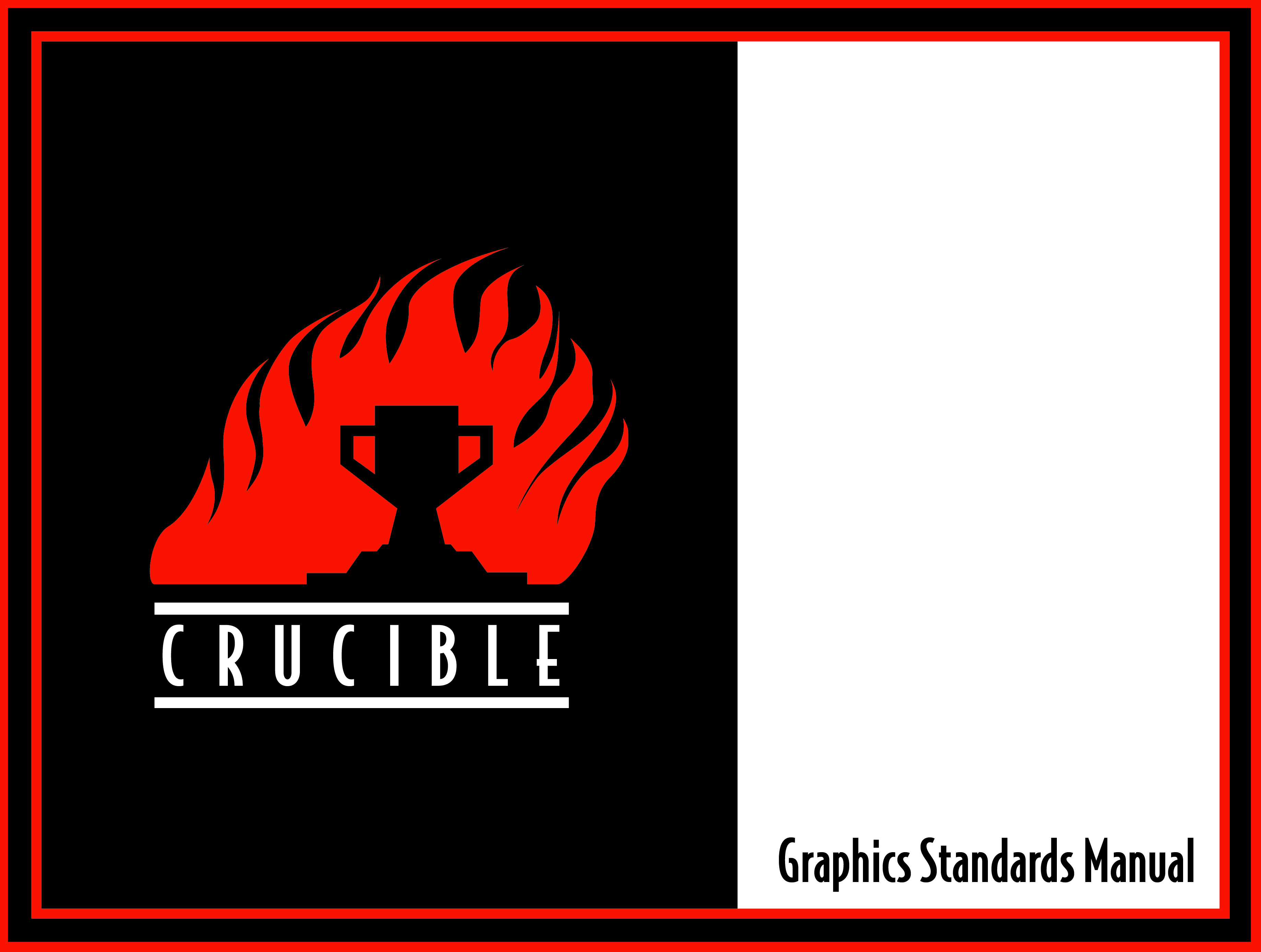
I switched up the border a little on the cover. I wanted to tone down the thickness of the stroke but also added a second redo border so that the theme of “two lines” is carried through. Now that I think of it I should have done the other pages like this.

No real change to this other than I switched from “Who We Are” to “Letter from the President” and added a photo at the end along with an image of Michael Jackson’s signature. But no one would know it is his. I got it off pixabay, the free image site.

I added copy and three more logos which can be used. After making a mock up of a website it seemed necessary to expand the logo to serve as an informational piece as well. That way people aren’t scratching their heads over a lone “Crucible” logo with no indication of what it means.

I don’t think this page changed much.

I added copy to the Primary Colors page. I also decreased the opacity on the photo so that the copy would be more legible.

I toned down the background image’s opacity so that the body copy would be more legible.

No change was made to this page.

I added the social media logos along with the handles. It might be redundant with the handles already above the photos.

I’m really happy with the way this page turned out. I did take inspiration from another website to create this one. The “Crucible Industrial Arts” logotype works well here.

I added all the social media handles to the back as well as changed the address to a street address. I changed it on the Print Media page as well. I changed the border to what I did for the cover.


